For years, users of the Plex media server ecosystem have navigated a complex, ever-expanding mobile interface that sought to balance the platform’s roots as a personal media organizer with its ambitions as a streaming aggregator. However, that balancing act often left power users—those who rely on Plex primarily to host their own collections of movies, TV shows, and music—feeling like secondary citizens in their own app.
That is set to change. Plex has officially launched a public preview of its revamped mobile application, a redesign that signals a significant strategic pivot toward user-centric design, streamlined navigation, and a renewed focus on personal media libraries.
The Core Shift: Returning to the Roots of Media Management
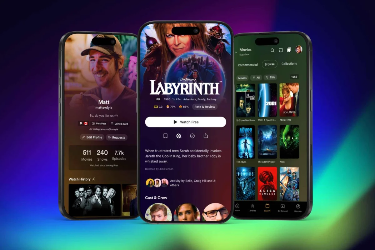
The most immediate and welcome change in the revamped Plex mobile app is the excision of the "hamburger" menu. For years, this three-line icon in the top-left corner served as a catch-all container for everything from personal library access to ad-supported streaming video, watchlists, and social discovery features. Its removal represents more than a minor UI tweak; it marks a philosophical shift in how Plex intends to present its content.
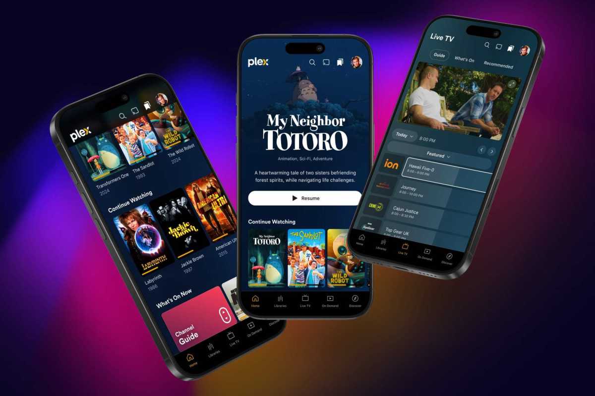
In the new version, the bottom navigation bar has been re-engineered to prioritize the user’s personal media. A dedicated "Libraries" tab now sits front and center, providing immediate access to the user’s self-hosted content. This replaces the cluttered, top-heavy navigation of the past, which often required users to dig through multiple layers of menus to reach their own files.
Alongside the "Libraries" tab, the new navigation structure includes streamlined entries for "Live TV," "On Demand," and "Discover." Notably, Plex has removed several tabs that critics previously labeled as unnecessary "clutter," including "Trending," "Activity," "Find Friends," and "My Profile." These features, which were often viewed as intrusive attempts to push Plex’s social ecosystem on users who simply wanted to watch their own media, have been minimized or tucked away into a more cohesive user menu.
A Chronology of the Redesign
The road to this interface overhaul has been a gradual process of evolution for the company. To understand why this change is occurring now, one must look at the recent history of Plex’s development strategy:
- September 2024: Plex officially announced a "future-focused" strategy, promising to streamline its platform and address years of user feedback regarding app bloat and feature creep.
- Late 2024 (The Unbundling Phase): As part of this broader strategy, Plex began the process of spinning off specific media types into standalone experiences. Music playback was migrated to the dedicated Plexamp application, and a standalone "Plex Photos" app entered beta testing, allowing the main Plex app to shed the weight of being an all-in-one media management tool.
- November 2024: The public preview for the core Plex mobile app was released to a wider user base. This version represents the first major visual implementation of the unified codebase strategy that Plex has been working on behind the scenes.
- Early 2025 (Projected): Plex intends to exit the public preview phase and roll out the redesigned interface to all mobile users, pending the resolution of feature gaps identified during the testing period.
Supporting Data and Technical Underpinnings
While the visual changes are the most apparent, the "under the hood" work is arguably the most significant aspect of this update. Plex has committed to a complete top-to-bottom code overhaul of its application suite.

For years, the disparate nature of Plex’s various clients—ranging from smart TVs and web browsers to iOS and Android—led to inconsistent update cycles. By moving to a unified codebase, Plex aims to standardize features and accelerate the delivery of updates across all platforms. This shift is expected to improve performance, reduce bugs, and allow for more rapid experimentation with UI elements, such as the "expanded artwork" initiative.
In the new app, title art for movies and TV shows will be presented more prominently. Where available, the app will utilize high-quality, full-color title cards rather than the plain, text-heavy descriptions that defined previous versions. This shift towards a more visual, "streaming service-style" aesthetic is designed to make personal media collections feel as polished as commercial platforms like Netflix or Disney+.
Official Perspectives and the "Social" Dilemma
Plex has faced mounting criticism over the last two years regarding its aggressive push into social features and ad-supported content. Many long-time users expressed concern that the platform was straying from its utility as a private media server to become a content aggregator with privacy-invasive social components.
In its official communications regarding the preview, Plex has struck a conciliatory tone. The company acknowledges that while some users enjoy the social aspects of the platform—such as sharing watchlists or connecting with friends—the primary value proposition remains the personal library. By "streamlining" the social features into the Discover tab and a dedicated user menu, the company is attempting to satisfy the social power users without alienating the "purists" who wish to keep their media consumption private and focused.
However, the transition is not without its growing pains. The company has been transparent about the current state of the preview:
"We are committed to closing the gaps as the testing process continues," a spokesperson for the company noted.
Key missing features in the current preview build include advanced playlist management and robust media-casting support (e.g., casting to external displays). These are considered "must-have" features for a significant portion of the user base, and their absence underscores that this is very much a work in progress.
Implications for the Media Server Market
The implications of this redesign extend beyond mere convenience. As the home media server market matures, competition from platforms like Jellyfin and Emby has intensified. These alternatives often pride themselves on a "no-nonsense" approach that avoids the social and commercial bloat that Plex has occasionally embraced.
By simplifying its interface and refocusing on the core library experience, Plex is effectively mounting a defensive maneuver to retain its user base. If the company can successfully deliver a faster, cleaner, and more reliable app, it will likely stave off the migration of its power users to open-source alternatives.
Furthermore, the "unbundling" strategy—separating music and photos—is a smart move that acknowledges the diverse ways people use the platform. By tailoring specific apps to specific media types (Plexamp for audiophiles, the main app for video enthusiasts), Plex is creating a more specialized, professional ecosystem.
Conclusion: A Promising Horizon
For the average Plex user, the upcoming redesign offers a glimpse of a more refined, responsive, and respectful interface. The removal of the hamburger menu and the elevation of the "Libraries" tab are clear indicators that the company is listening to its community.
While the current public preview is undeniably incomplete—missing critical functionality that will need to be addressed before a full release—the direction is undeniably positive. The transition to a unified codebase, coupled with a design language that puts the user’s own media back in the driver’s seat, suggests that Plex is ready to mature into a platform that can cater to both casual viewers and serious media archivists.
As the calendar turns toward 2025, all eyes will be on whether the company can successfully "close the gaps" and deliver an app that feels as premium as the media libraries it hosts. For now, the public preview offers a refreshing, simplified vision of what the future of personal media streaming could look like.