For years, Plex users have grappled with an increasingly cluttered interface that often buried their personal media collections behind layers of discovery features and streaming service advertisements. That frustration is finally being addressed. In a significant shift in design philosophy, Plex has launched a public preview of its revamped mobile application—a move that signals a return to the platform’s roots as the premier home for self-hosted media.
By ditching the cumbersome "hamburger" menu and reorganizing the navigation architecture, the company is attempting to appease a core user base that has long demanded a more streamlined experience. This update, which follows a broader strategic announcement made by the company in September, aims to reclaim the app’s focus on personal libraries while balancing the needs of the modern, casual streamer.
The Core Transformation: Simplifying the Interface
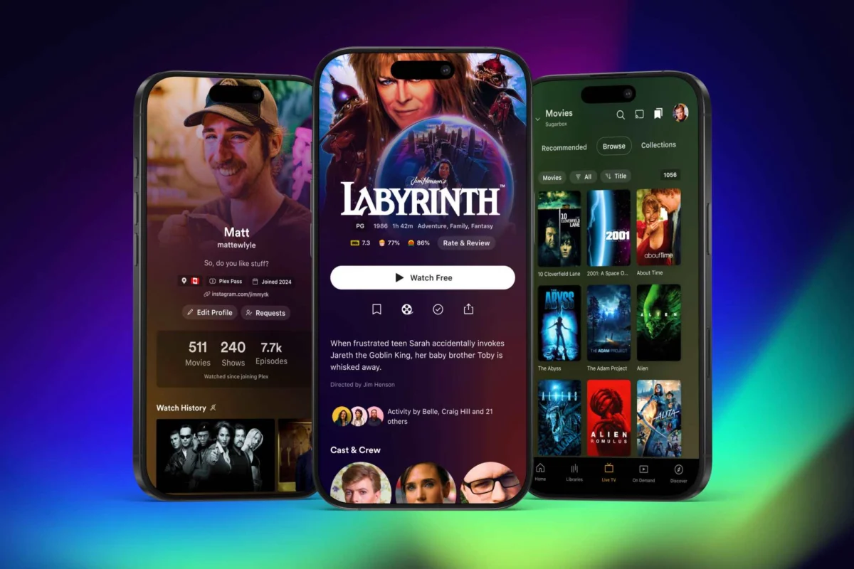
The most immediate change users will notice in the preview version is the death of the "hamburger" menu—the three-line icon that previously held everything from watchlists and social features to the user’s actual movie and TV collections. For power users who maintain robust personal media servers, this was a significant point of friction.
In the new layout, the bottom navigation bar has been fundamentally redesigned. It now centers on a dedicated "Libraries" tab, providing a direct, one-tap gateway to a user’s local content. This shift effectively elevates personal media from a buried sub-menu to a primary pillar of the application.
Alongside the "Libraries" tab, the bottom navigation includes:
- Live TV: Quick access to free ad-supported television channels.
- On Demand: Plex’s growing library of ad-supported streaming content.
- Discover: A centralized hub for tracking trending media and social features.
By removing peripheral tabs such as "Trending," "Activity," "Find Friends," and "My Profile" from the bottom bar, Plex is clearing the visual noise. While these features are still accessible for those who engage with the social side of the platform, they are no longer prioritized at the expense of the user’s primary library.

Chronology: A Strategy Shift in the Making
The road to this redesign began long before the current public preview. To understand the gravity of these changes, one must look at the progression of the platform over the last few years:
- Early 2020s: Plex began an aggressive pivot toward becoming an "all-in-one" media hub, integrating ad-supported movies, TV shows, and music into the main interface. While this grew the company’s revenue, it drew criticism from long-time users who felt the app was becoming bloated.
- September 2024: Plex officially announced a "new strategy" aimed at focusing and streamlining the user experience. The company acknowledged that the "all-in-one" approach had made the main app too complex for many users.
- Late 2024 (Current Phase): The public preview of the redesigned mobile app marks the first major public-facing milestone of this new strategy.
- Early 2025 (Projected): Plex expects the new interface to graduate from its preview status and become the standard for all mobile users.
This transition is also marked by the "unbundling" of services. Recognizing that personal media, music, and photos require different user experiences, Plex has begun spinning off specialized content into dedicated apps. Music playback has already been moved to the popular Plexamp application, and a Plex Photos app is currently in development.
Supporting Data: The Unified Codebase
Underpinning these aesthetic changes is a massive engineering effort. Plex has confirmed that it is conducting a "top-to-bottom" code overhaul. For years, the inconsistency in user experience across different platforms—iOS, Android, smart TVs, and web browsers—has been a source of technical debt for the company.
By moving to a unified codebase, Plex aims to:
- Accelerate Feature Deployment: New features can be pushed to all platforms simultaneously rather than waiting for platform-specific development cycles.
- Improve Stability: A singular codebase makes it easier for the engineering team to squash bugs and optimize performance.
- Ensure Design Consistency: Users will no longer feel as though they are using a different app when switching from a phone to a tablet or a dedicated streaming device.
While this backend work is invisible to the average user, it is arguably the most important part of this update. It provides the foundation for the "expanded artwork" integration mentioned in the preview, which will feature richer, more cinematic title art for movies and TV shows—a cosmetic upgrade that requires a more efficient and responsive app architecture to function without lagging.
Official Responses and Developer Transparency
Plex has taken a surprisingly transparent approach to this public preview, setting clear expectations for what is currently missing. In a post on their official forums, developers admitted that while the core architecture is sound, the preview is currently "missing some key features" that power users rely on daily.
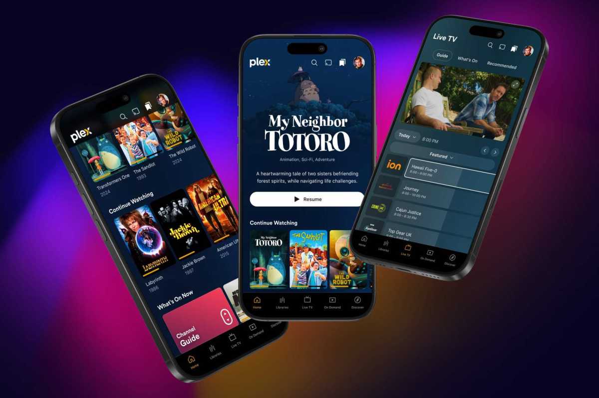
Notably, playlist management and media-casting support are currently absent from the preview. For many, these are not "extra" features but essential components of the Plex experience. The company has stated that it plans to "close those gaps" as the testing process progresses.
The strategy of releasing a "feature-incomplete" public preview is a calculated move to gather user feedback before the final rollout in 2025. By allowing the community to test the app in its current state, Plex can identify which missing features are the most critical to reintroduce, ensuring that when the update finally replaces the current app, it doesn’t cause a massive wave of user attrition.
Implications for the Ecosystem
The implications of this redesign are significant for both the company and the user base. For the user, it is a sign that Plex is listening to the "server-first" crowd. The move to isolate music and photos into separate apps, while perhaps annoying to those who prefer a single app for everything, ultimately results in a more focused and less cluttered experience.
However, the "social" controversy remains. Despite the streamlining, Plex continues to push features like "Discover Together," which allow users to see what their friends are watching. While these features are now tucked away into the "Discover" tab, they remain a source of privacy concern for some users. The company is clearly walking a tightrope: trying to maintain its status as the best personal media server for enthusiasts while simultaneously trying to build a social network that justifies its value to investors and casual users.
Ultimately, this redesign represents a maturity phase for Plex. After years of expanding the feature set to see what would stick, the company is now pruning the garden. By refocusing on the core utility of the app—the library—Plex is acknowledging that its most loyal users are not those who use it for ad-supported streaming, but those who host their own digital archives and expect a clean, intuitive, and high-performance interface to access them.
As we move into 2025, the success of this redesign will likely hinge on whether the company can successfully re-integrate the missing casting and playlist features without re-introducing the "bloat" that necessitated this overhaul in the first place. For now, the public preview offers a glimpse of a more refined, professional, and user-centric future for the platform.