For years, the Plex mobile application has walked a precarious tightrope. As the platform evolved from a niche tool for home media enthusiasts into a global streaming powerhouse, its interface grew increasingly cluttered. Users who simply wanted to access their personal movie and television libraries found themselves navigating a labyrinth of "hamburger" menus, ad-supported streaming recommendations, and social features that many power users found intrusive.
That era of navigation fatigue is coming to an end. Plex has officially launched a public preview of its redesigned mobile application—a move that marks the most significant UI/UX shift in the company’s history. By stripping away unnecessary bloat and elevating personal media to the forefront, Plex is signaling a return to its foundational promise: providing the best possible way to organize and enjoy your own content.
The Core Transformation: Navigation and Usability
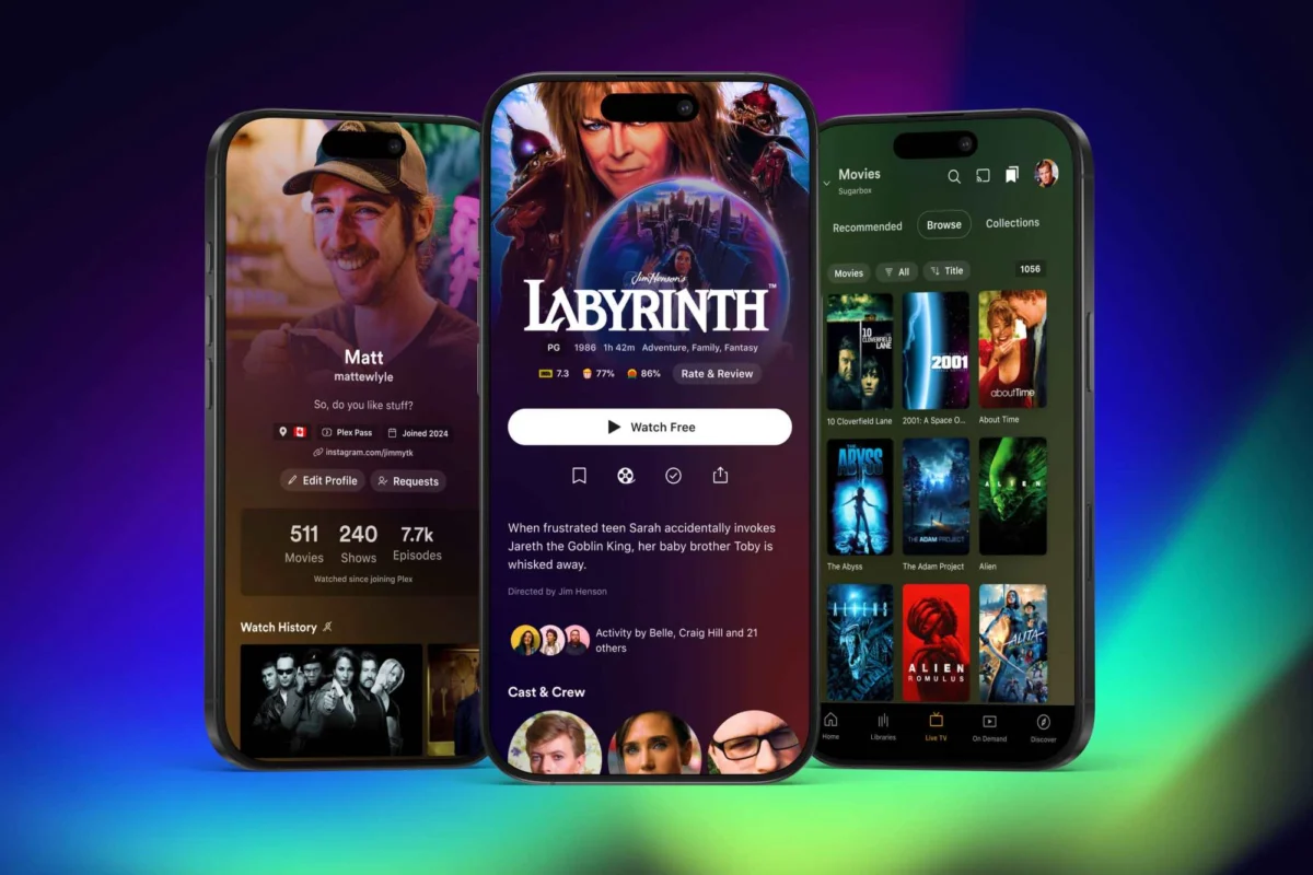
The most immediate and welcome change in the revamped Plex mobile app is the death of the top-corner "hamburger" menu. In the previous iteration, this catch-all button served as a digital junk drawer, housing everything from your "Watchlist" and "Discover" features to ad-supported streaming content. Users often had to tap and scroll through several layers just to reach their own server content.
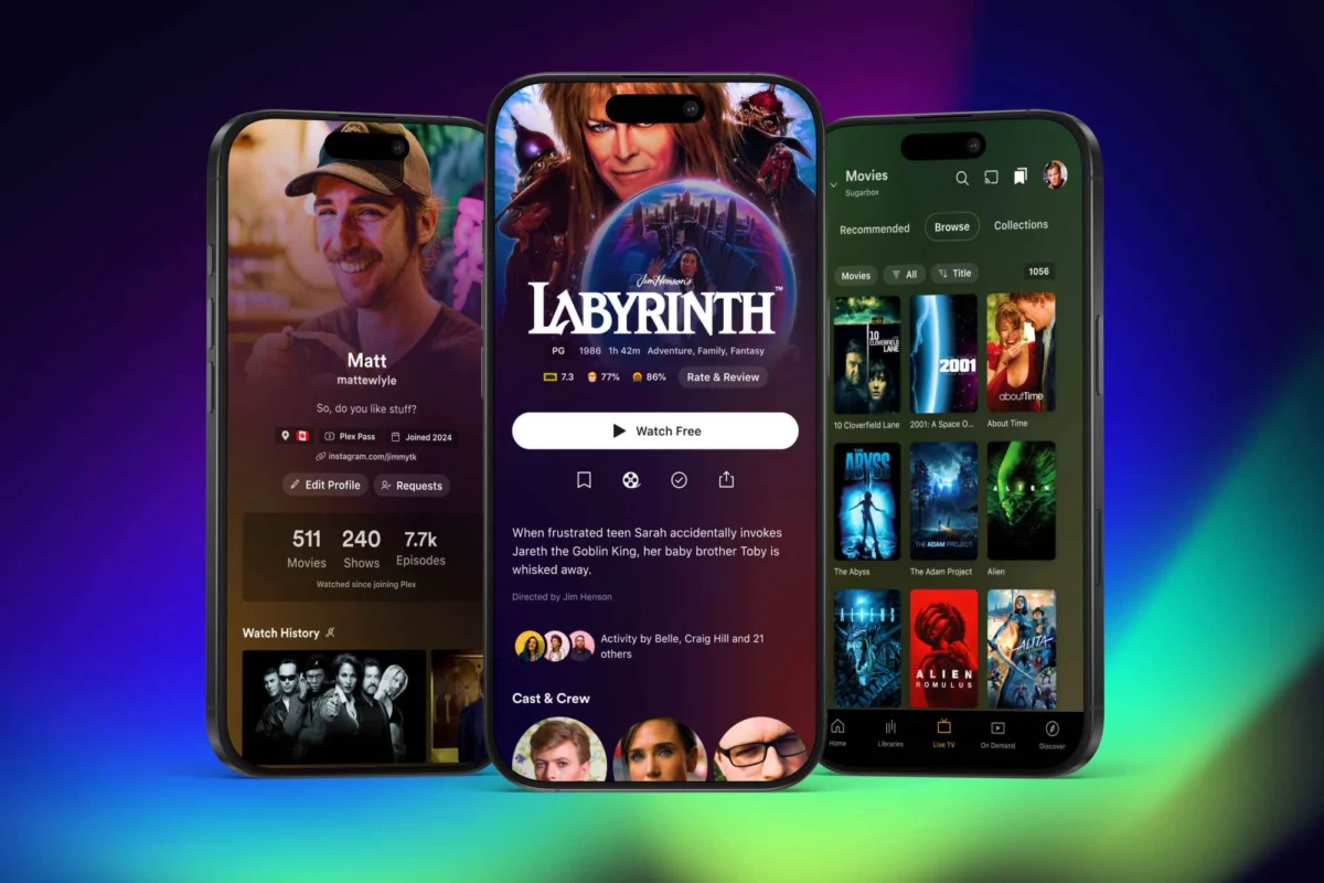
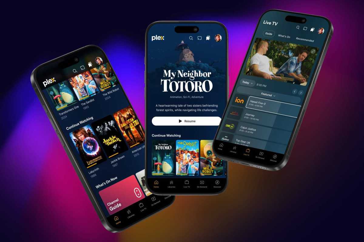
In the new design, the interface has been overhauled to prioritize personal media. The bottom navigation bar has been simplified and reoriented to put the user’s library front and center. A dedicated "Libraries" tab now provides a direct, one-tap route to personal content. Accompanying this are dedicated tabs for "Live TV," "On Demand," and "Discover," creating a clean, logical separation between Plex’s hosted content and the user’s private files.
Furthermore, Plex has removed the peripheral distractions that previously occupied the bottom navigation, such as "Trending," "Activity," "Find Friends," and "My Profile." These elements, which were widely viewed as attempts to force social engagement upon a user base that primarily wanted a media player, have been moved to less obstructive locations or consolidated within the user menu. For those who enjoy the social aspects of the platform, the "Discover" tab remains a hub for connecting with friends, ensuring that the platform remains versatile without compromising the primary viewing experience.
A Chronology of the Shift: From All-in-One to Modular
To understand the significance of this redesign, one must look at the trajectory of Plex over the last several years.

- 2020–2022: The Aggressive Expansion Phase. During this period, Plex leaned heavily into becoming a "one-stop-shop" for all things streaming. The company introduced its own ad-supported video-on-demand (AVOD) service, live TV, and the "Discover" social features. While these additions grew the platform’s user base, they also introduced "feature creep," leading to a fragmented UI that many enthusiasts felt strayed from the app’s original purpose.
- September 2024: The Strategic Pivot. Plex officially announced a new corporate strategy aimed at "streamlining and focus." The company acknowledged the feedback from its core user base, noting that the "everything-everywhere" approach had reached a point of diminishing returns in terms of user experience.
- Late 2024: The Modular Approach. As part of this strategy, Plex began spinning off specific media types into dedicated applications. Music playback was shifted entirely to the highly acclaimed "Plexamp" app, while a dedicated "Plex Photos" app was moved into beta testing. This modular approach allows the main app to focus purely on video content, while specialized apps provide a deeper, more tailored experience for audio and photography enthusiasts.
- November 2024: The Public Preview. The rollout of the revamped mobile app marks the first tangible consumer result of this code-level overhaul.
Technical Underpinnings: The Unified Codebase
Beneath the visual changes lies a massive, behind-the-scenes engineering effort. Plex is currently transitioning its entire suite of applications to a unified, modernized codebase. For the average user, the benefits of this are not immediately visible, but they are critical for the app’s longevity.
A unified codebase means that future feature updates, security patches, and performance optimizations can be pushed to iOS, Android, and other platforms simultaneously, rather than being staggered. It also addresses long-standing complaints regarding the app’s sluggishness on older hardware. By reducing technical debt, the engineering team can focus on refining the interface and introducing new, requested features rather than constantly patching compatibility issues across disparate versions of the app.
The redesign also introduces a more sophisticated use of metadata and artwork. In the current iteration, title detail pages are often sparse, relying on plain text to describe content. The new version utilizes "expanded" artwork, pulling high-quality title cards and backgrounds that mirror the premium look and feel of major commercial streaming services like Netflix or Disney+.
Official Responses and Strategic Implications
Plex’s leadership has framed this transition as a listening exercise. In a recent company blog post, the team emphasized that the future of Plex is "focused, streamlined, and ready for feedback." By opening an opt-in public preview, the company is effectively crowdsourcing the final polish of the application.
However, the transition is not without its growing pains. Plex has been transparent about the fact that the current public preview is a work in progress. Specifically, users who install the preview will notice the absence of key features, most notably robust playlist support and media-casting capabilities. The company has stated that these are not permanent omissions but rather "gaps" that will be closed as the software progresses toward its final release.
This transparency is a calculated risk. By releasing a feature-incomplete version to the public, Plex is inviting scrutiny. However, it also allows the company to test the new UI architecture in real-world scenarios—on various screen sizes and under different network conditions—ensuring that the final product is stable.
Implications for the Media Enthusiast
For the "homelab" community and the average Plex Pass subscriber, this redesign is a massive win. The implications are three-fold:
- Reduced Friction: By removing the social and ad-supported noise from the main flow, the time-to-play—the duration between opening the app and starting a movie—is significantly reduced.
- Professionalization of Personal Media: The emphasis on high-quality artwork and a cleaner UI treats personal libraries with the same aesthetic respect as high-budget streaming services, reinforcing the value of maintaining a private media collection.
- Long-Term Stability: The shift to a unified codebase suggests that the days of "platform-specific bugs" may finally be drawing to a close. Users can expect a more consistent experience regardless of the device they use to consume their content.
As we look toward the projected launch in early 2025, the challenge for Plex will be balancing the needs of their "power users"—those with massive 4K libraries and custom servers—against the needs of the casual user who just wants a simple way to watch their movies on the go.
If the current preview is any indication, Plex has finally recognized that its greatest asset is not its ad-supported catalog or its social networking tools, but the deeply personal libraries that users have spent years building. By clearing the clutter and focusing on the core media experience, the company is positioning itself to remain the gold standard for home media management for the next decade.
For those interested in testing the new interface, the opt-in public preview is currently available via the official Plex forums. As the company continues to iterate, the "gaps" will close, and the result promises to be the most refined, user-centric version of Plex to date.