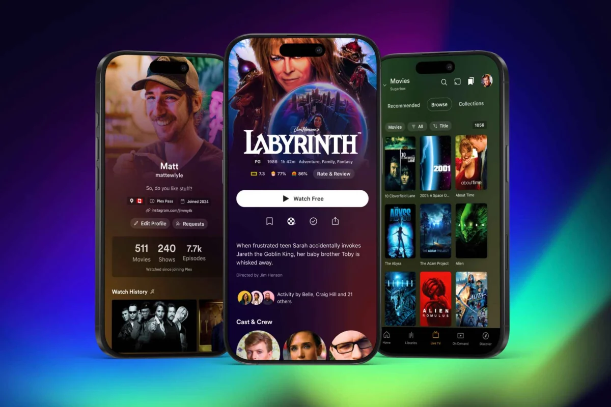
For years, the Plex mobile application has served as a sprawling portal, attempting to balance the needs of power-user media enthusiasts with a growing suite of ad-supported streaming features, social discovery tools, and cloud-based content. For many long-time users, the interface had become increasingly cumbersome, characterized by hidden menus and a cluttered navigation hierarchy.
In a significant pivot, Plex has officially launched a public preview of a completely revamped mobile application. This redesign, which signals a return to the platform’s roots as a home-media management powerhouse, promises a more streamlined, user-centric experience that elevates personal libraries while curbing the bloat of non-essential social and discovery features.
The Core Shift: Ditching the "Hamburger" Menu
The most immediate and welcome change for long-time Plex users is the removal of the infamous "hamburger" menu (the three-line icon typically tucked in the top corner). In the legacy version of the app, this menu acted as a catch-all, forcing users to navigate through layers of ad-supported streaming video, "Discover" feeds, and watchlist prompts just to reach their personal server content.
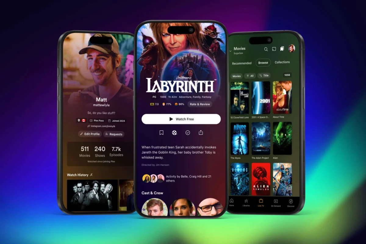
The new design replaces this obfuscation with a clean, bottom-navigation bar. Users can now jump directly to their personal media via a dedicated "Libraries" tab. This reorganization places the user’s own content front and center, a move that directly addresses years of community feedback requesting a faster, more intuitive way to access local server libraries. The new bottom navigation also includes quick-access tabs for "Live TV," "On Demand," and "Discover," creating a more logical separation between user-owned content and Plex’s broader streaming ecosystem.
Chronology: The Road to a Reimagined App
The current public preview is the culmination of a strategic shift that Plex first signaled in September 2024. Following a period of aggressive expansion—where the company integrated everything from social networking features to collaborative watchlists—the feedback from its core user base was clear: the app was becoming too difficult to navigate.

- September 2024: Plex announced a new, long-term product strategy focused on "focus and streamlining." The company stated its intention to refine the mobile experience and improve performance through a unified codebase overhaul.
- Late 2024: Plex began spinning off specialized functionality into standalone applications. Music playback was officially relegated to the dedicated Plexamp app, and the Plex Photos app moved into a focused beta testing phase.
- November 2024: The public preview for the core Plex mobile app launched. This milestone introduced the redesigned navigation and the removal of the top-corner menu, marking the first time the public could test the interface changes.
- Early 2025 (Projected): Plex expects the new mobile app to graduate from its preview status to a full, stable release, incorporating feature parity for functions currently missing from the test build.
Supporting Data and Design Enhancements
Beyond the navigational changes, the redesign introduces a more visually rich interface. The company is implementing an "expanded" use of artwork, specifically prioritizing title art for movies and television shows. In previous iterations, users often navigated through plain, text-heavy lists; the new design aims to make the browsing experience feel more like a modern streaming platform, utilizing high-resolution assets to showcase content libraries.
However, the transition is not without its trade-offs. As is common with early-access software, the current public preview is missing several features that legacy users consider essential. Notably, the preview lacks support for playlist management and media-casting (the ability to "cast" content to other screens). Plex has acknowledged these gaps, stating that they are actively working to restore these functions as the development cycle progresses.
The Strategy Behind the Split
The redesign is part of a larger "divide and conquer" philosophy. By spinning off music and photo management, Plex is attempting to reduce the "feature creep" that has historically bogged down its main application.
This approach serves two purposes. First, it allows the main Plex app to become a lean, high-performance gateway for video playback. Second, it empowers the standalone apps—like the highly-regarded Plexamp—to receive dedicated updates and feature sets that would otherwise be difficult to implement within a monolithic application. The transition to a unified codebase also promises a "top-to-bottom" improvement in app stability and, ideally, faster deployment of updates across both iOS and Android platforms simultaneously.
Implications for the User Base
For the "social butterfly" contingent of the Plex user base, the changes may feel like a retreat. The removal of the "Trending," "Activity," and "Find Friends" tabs from the primary navigation bar suggests that Plex is de-prioritizing the social networking features that were, at times, met with privacy concerns and user confusion. While social features remain accessible via the "Discover" tab and a streamlined user profile menu, they are no longer competing for space with the primary task of watching media.
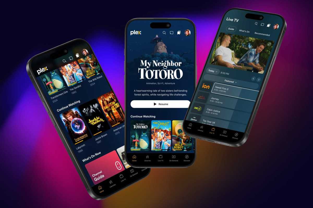
For the typical Plex Pass subscriber—who primarily uses the platform to stream their own ripped DVDs, Blu-rays, or digital purchases—the implications are largely positive. The update signals that Plex is listening to its power users, acknowledging that the platform’s primary value proposition is the seamless management of personal media. By reducing the friction required to reach one’s own content, the company is effectively lowering the barrier to entry for casual users and improving the "time-to-content" metric for power users.
Official Stance and Future Outlook
Plex has been transparent about the fact that this is a work in progress. By hosting the preview through the official Plex forums, the company is inviting community-driven feedback to shape the final release.
"Our goal is to build an experience that is focused, streamlined, and ready for user input," the company noted in their initial product roadmap. The "early 2025" target for the full release suggests that Plex is not rushing the transition, preferring to ensure that the "gaps" in functionality—like casting and playlists—are fully addressed before pushing the update to the general public.
As the industry continues to consolidate around massive, ad-driven streaming giants, Plex remains a unique entity: a bridge between physical media collectors and the digital future. Whether this redesign will successfully strike the balance between a clean interface and the deep, complex functionality that Plex is known for remains to be seen. However, the current trajectory suggests a company that is maturing, realizing that the best user experience is often defined as much by what you remove as what you add.
For those interested in testing the preview, instructions and forum discussions are available on the official Plex Experience Preview page. As we approach 2025, the tech community will be watching closely to see if this "back-to-basics" approach restores the app to its former position as the gold standard for personal media consumption.