For years, the Plex mobile experience has been a tug-of-war between the platform’s roots as a powerhouse for personal media management and its ambitions to become a centralized, ad-supported streaming aggregator. Long-time users, often frustrated by navigating cluttered "hamburger" menus to access their own locally hosted movies and shows, have frequently voiced their desire for a more focused interface.
Plex is finally listening. The company has officially launched a public preview of a completely redesigned mobile application, signaling a strategic shift that places personal media libraries back at the forefront of the user experience.
The Main Facts: A Cleaner, More Focused Interface
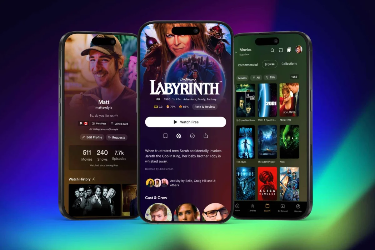
The centerpiece of this redesign is a fundamental structural change to the navigation bar. Gone is the reliance on the top-left "hamburger" menu (the three-line icon), which previously acted as a catch-all for disparate services, including the Watchlist, ad-supported streaming content, and the elusive, buried access to personal user libraries.
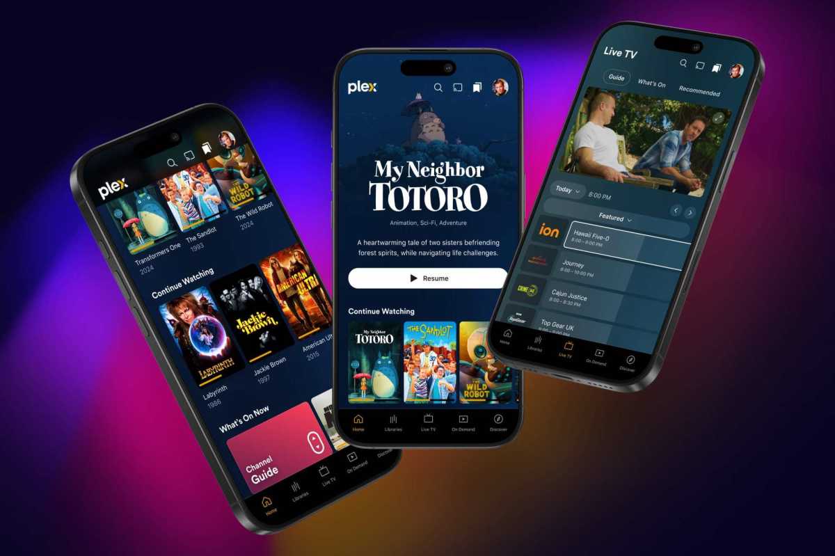
In the new iteration, Plex is implementing a simplified, tab-based navigation at the bottom of the screen. Users will now find a dedicated "Libraries" tab, providing immediate, one-tap access to their own media. This tab sits alongside "Live TV," "On Demand," and "Discover," effectively separating the user’s personal content from the company’s promotional and third-party streaming offerings.
By removing extraneous tabs that previously dominated the bottom navigation—such as "Trending," "Activity," "Find Friends," and "My Profile"—Plex is clearly attempting to strip away the social-first bloat that has drawn criticism from privacy-conscious users. While social features remain accessible via a refined user menu and the "Discover" tab, they no longer occupy prime real estate in the app’s primary navigation.
Furthermore, the update introduces a more visual design language, promising "expanded" use of title art for movies and television shows. This shift from simple, text-based labels to richer, more immersive artwork is expected to modernize the aesthetic of the app, bringing it more in line with the high-fidelity presentation found in competitive streaming platforms like Netflix or Apple TV.

A Chronology of Change: The Road to Redesign
The path to this mobile overhaul began in earnest in September 2024, when Plex announced a broad, long-term product strategy. The company’s leadership identified that as their ecosystem expanded, the "do-everything" nature of their main application was beginning to compromise the usability of its core features.
- September 2024: Plex announces a pivot in its development strategy, focusing on a "focused and streamlined" user experience. The company confirms plans to decompose the "all-in-one" app by spinning off specialized features into standalone applications.
- Late 2024: The "Plexamp" app is solidified as the dedicated home for music playback, while the "Plex Photos" app enters a formal beta testing phase, effectively offloading media types that previously cluttered the main interface.
- November 2024: Plex releases the public preview of the revamped mobile app. This rollout marks the first time the public can test the unified, overhauled codebase that the company has been developing behind the scenes.
- Early 2025 (Projected): Plex intends to conclude the public preview phase and transition the new design into a stable, general-release version for all mobile users.
Supporting Data: Why the Shift Matters
The decision to redesign is not merely an aesthetic choice; it is a technical and functional necessity. Behind the scenes, Plex is undertaking a massive, top-to-bottom code overhaul. By unifying their codebase across platforms, the company aims to reduce the "tech debt" that has historically made pushing updates to iOS and Android versions a slow, fragmented process.
For power users, this is a significant development. The current application has long suffered from "feature creep," where the integration of ad-supported "Movies & TV" (AVOD) and social discovery tools often led to performance latency and navigation headaches. By isolating these services into distinct tabs—or moving them out of the main app entirely, as is the case with music and photos—Plex is essentially reclaiming system resources to ensure that the primary library browser is faster and more responsive.
The move also addresses the "social fatigue" voiced by a segment of the user base. With the removal of tabs like "Activity" and "Find Friends" from the primary bottom bar, the app becomes significantly less intrusive, returning to its identity as a media server client rather than a social network.
Official Responses and Strategic Vision
In its communications regarding the preview, Plex has emphasized that the redesign is not just about moving buttons; it is about "feedback-driven development." The company is actively encouraging users to participate in the public preview through their dedicated forums, noting that the current version is a "work in progress."
Plex leadership has stated that the goal is to create an experience that feels "ready for feedback," implying that the final layout is still subject to change based on how the community interacts with the new navigation.
"We want the app to be focused, streamlined, and ready for the future," the company noted in its recent blog post. By inviting users to test the app in its current, "gapped" state, Plex is attempting to rebuild the trust that was strained by the controversial rollout of its "Discover Together" social features in previous years.
Implications for the User Experience
The Missing Pieces
It is important for users to note that the current preview is incomplete. As of the initial release, the app lacks support for playlist management and media casting—two core pillars of the traditional Plex experience. While the company has promised to "close those gaps" before the official 2025 launch, current users of the preview should expect a transitional experience.
The Shift Toward Modularization
The most significant long-term implication is the move toward a modular ecosystem. By pushing music to Plexamp and photos to a separate beta app, Plex is admitting that a single mobile interface cannot be the perfect home for every type of media. This modularity is a win for users who prioritize specific functions; those who use Plex primarily for music already benefit from the superior interface of Plexamp, and it is likely that the "Plex Photos" app will eventually offer a similarly specialized experience that the main app never could.
Privacy and the Social Element
For users who found the push toward social features to be an overreach, this redesign is a major victory. By tucking away the social networking components, Plex is signaling that it understands its core demographic: individuals who want to curate, manage, and watch their own private collections without being treated as social media users.
The Future of Development
The move to a unified, overhauled codebase is arguably the most impactful technical change. If successful, this will lead to faster updates, fewer platform-specific bugs, and a more consistent experience regardless of whether a user is on an iPhone, an Android device, or a tablet.
As we look toward 2025, the "new" Plex mobile app represents a return to its roots—a sophisticated, streamlined tool for media enthusiasts. While the transition period may be characterized by the occasional missing feature or UI quirk, the overarching direction is clear: Plex is finally clearing the clutter to let your personal library take center stage. For a platform that built its reputation on the power of local media ownership, this is a welcome and necessary evolution.